Graphic Designer – responsible for concept development, layout design, and visual storytelling for a 12-page promotional brochure.
Brief:
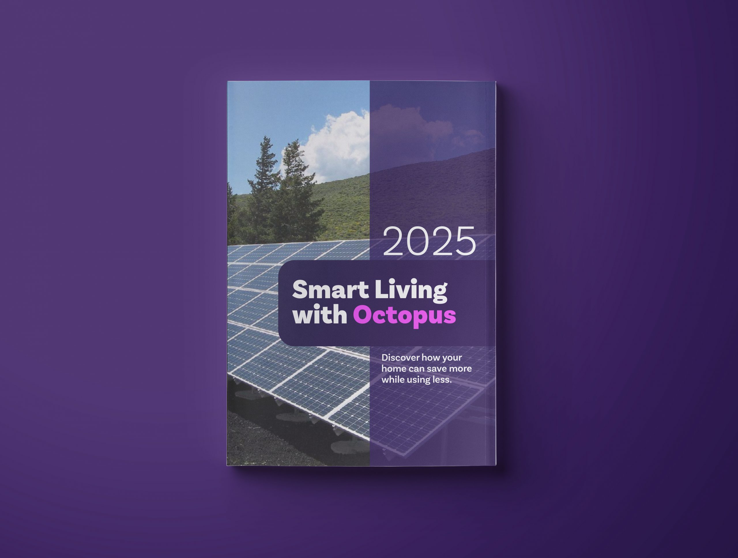
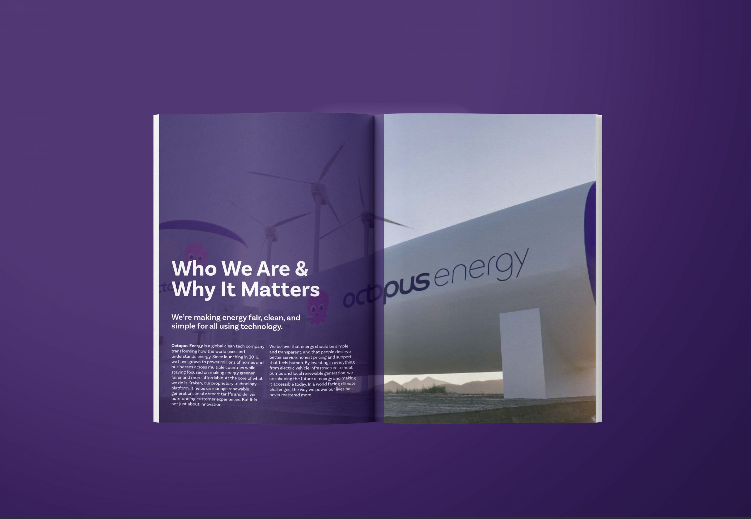
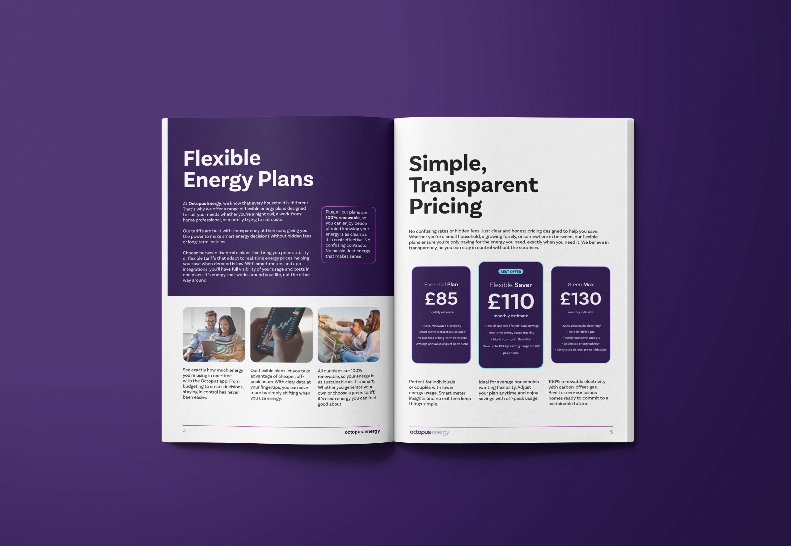
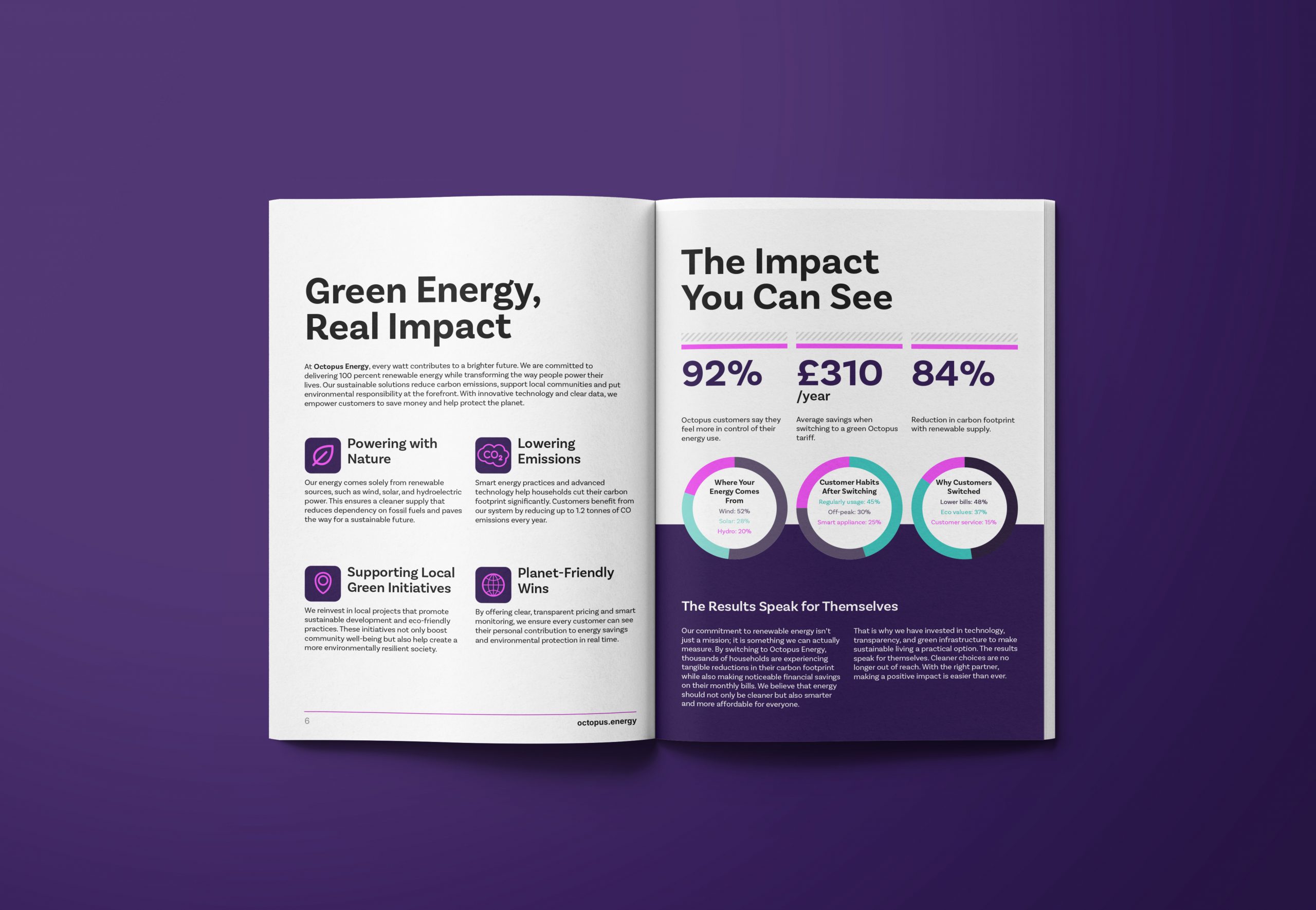
Create a brochure that communicates Octopus Energy’s commitment to green energy in a clear and engaging format. The brochure needed to speak to everyday consumers, showcase the benefits of switching, and reflect the brand’s friendly and innovative personality.
Process:
I began by researching the energy sector and reviewing Octopus Energy’s existing branding and tone. From there, I mapped out the content, built wireframes, and explored layout styles that would allow space for strong imagery, infographics, and bold statistics. The process involved continuous refinement to balance clarity with creativity, with close attention paid to typography, colour, and accessibility.
Outcome:
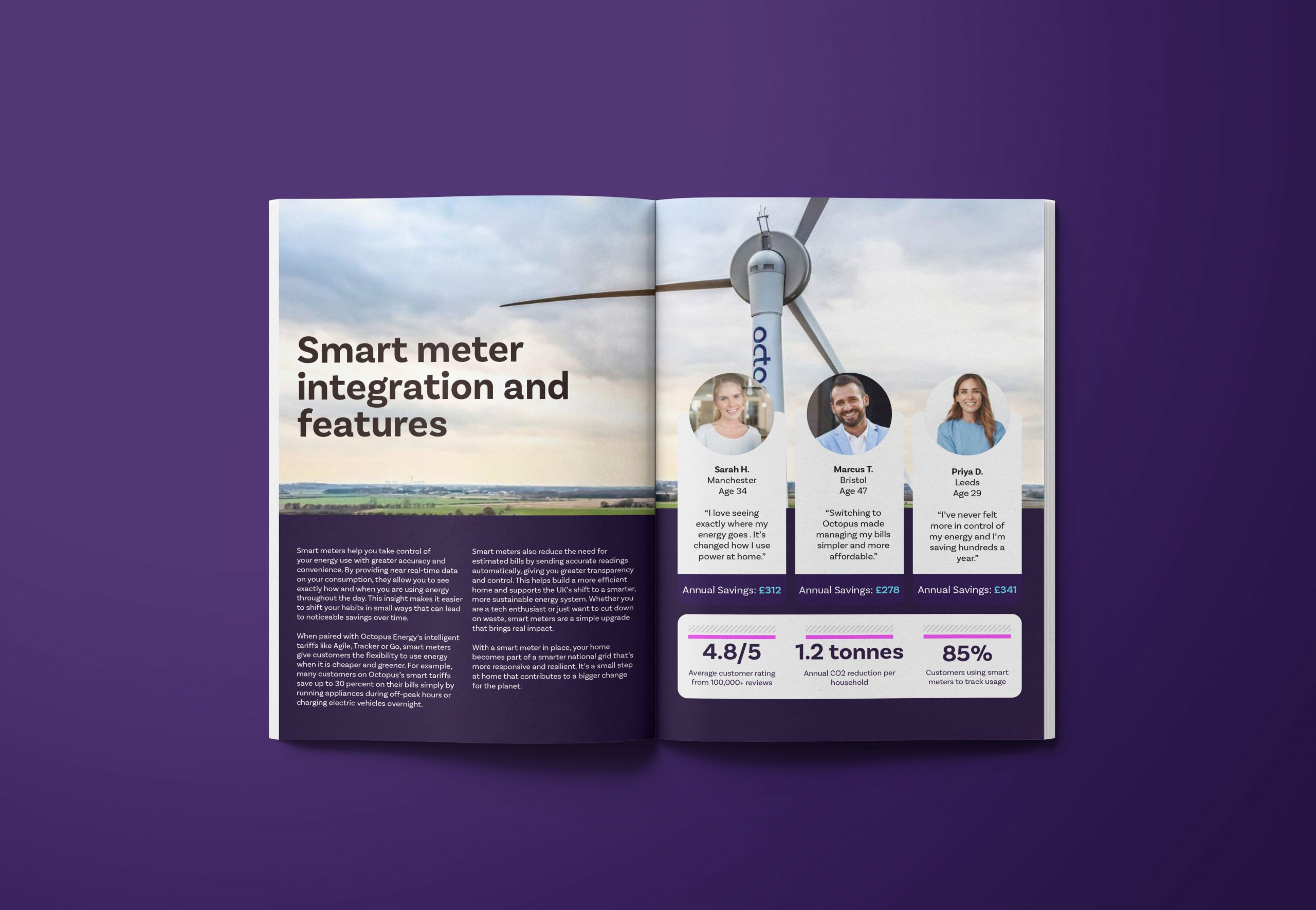
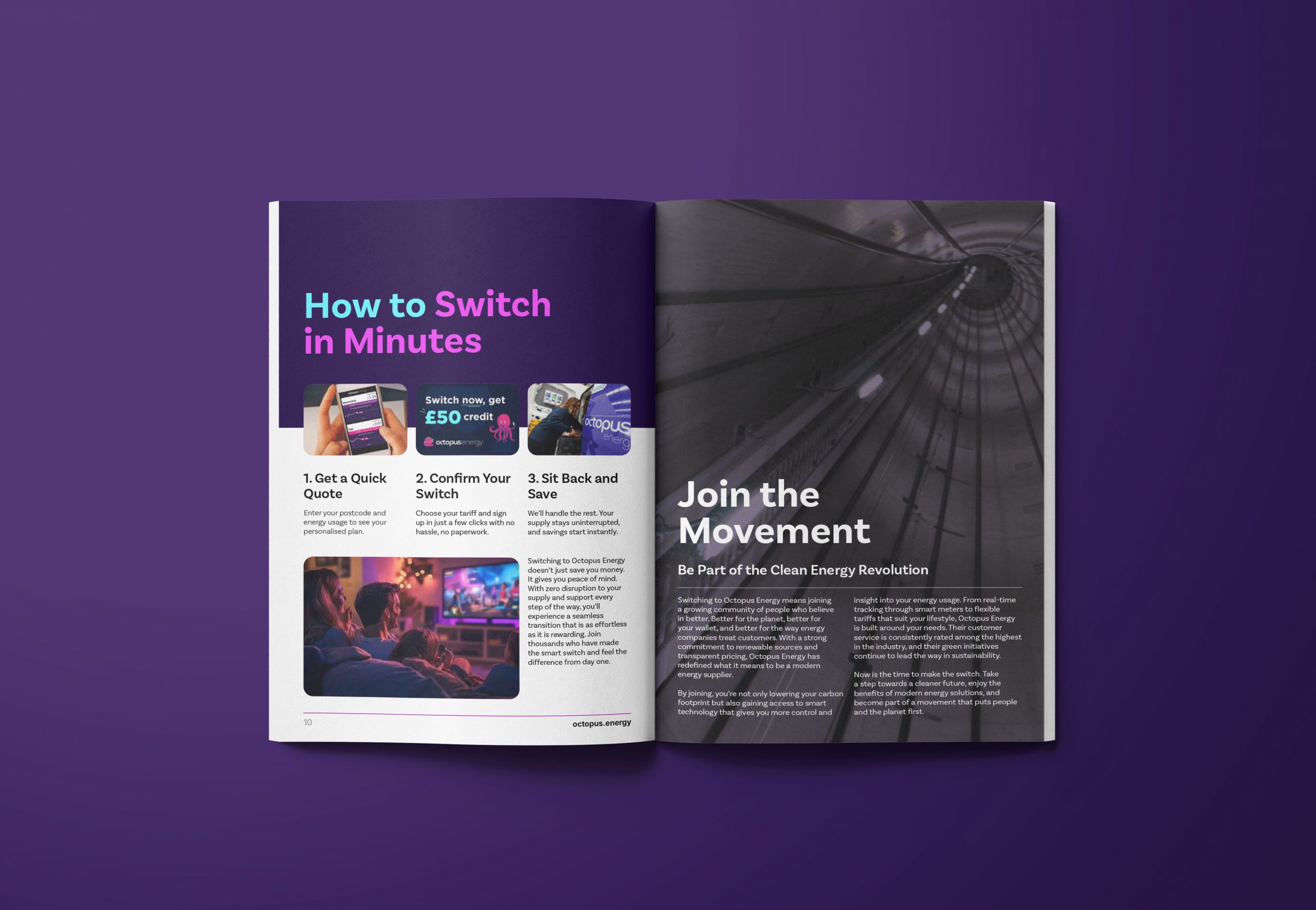
he final result is a print ready brochure that informs and inspires, with clear call to actions, easy to understand savings breakdowns, and a confident visual style. It reflects Octopus Energy’s identity and gives readers a reason to consider switching, all while making sustainability feel approachable and real.
Project Name/ Client:
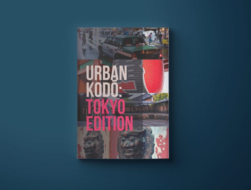
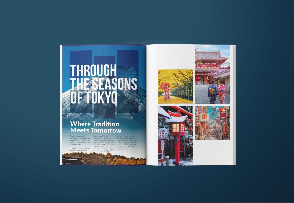
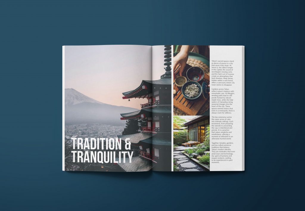
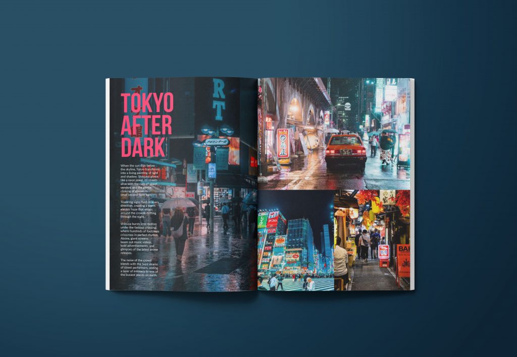
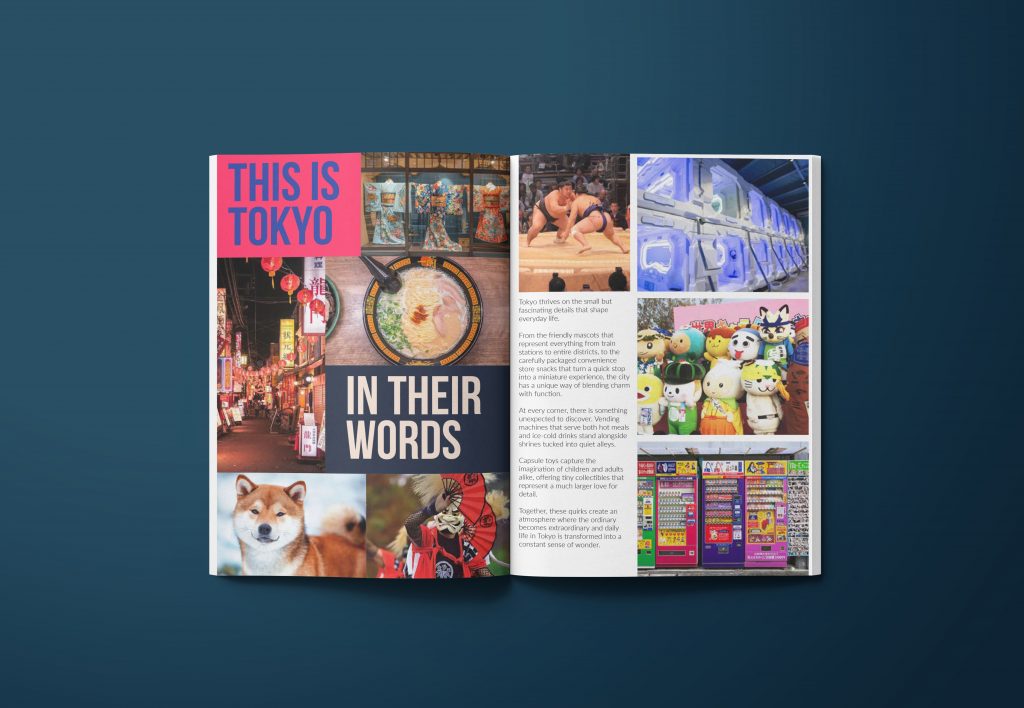
Urban Kodō
Role:
Graphic Designer – handled the concept direction, editorial layout, and overall look and feel of a 12-page travel magazine.
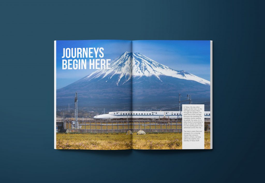
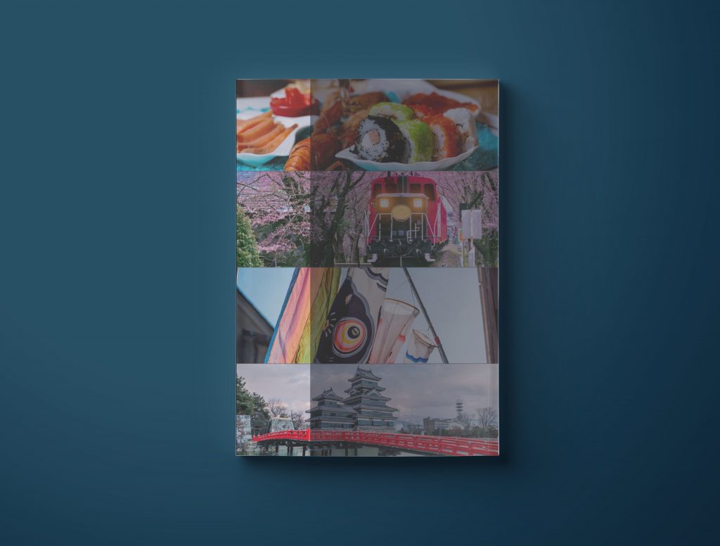
Brief:
The brief was to design a 12-page editorial piece that captures the vibrancy of Tokyo while remaining structured and accessible. The magazine needed to balance large visual spreads with strong editorial layouts.
Process:
I researched travel publications, built a clear page plan, and developed a visual identity inspired by Tokyo’s energy. Using clean grids, bold imagery, and considered typography, I created layouts that highlight both storytelling and design flow.
Outcome:
The result was a cohesive magazine that presents Tokyo through powerful visuals and engaging editorial content, offering readers both cultural insight and striking design.