Brand Designer responsible for modernising the TyrePros logo while maintaining its core identity.
Brief:
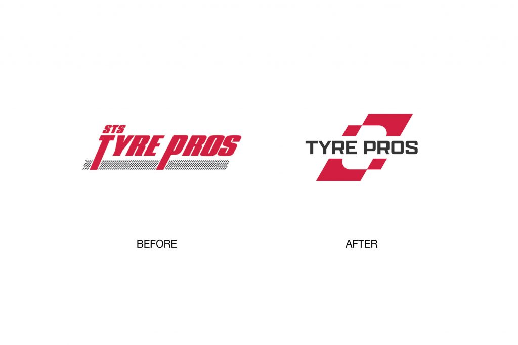
I was asked to modernise the TyrePros logo. The goal was to keep the original colours but create a cleaner, more versatile design. It needed to work well across all platforms.
Process:
The design process began with a brand audit and competitor review. Concepts were developed with a focus on clean typography and simplified forms. Feedback was gathered from stakeholders, and the chosen direction was refined through several iterations.
Outcome:
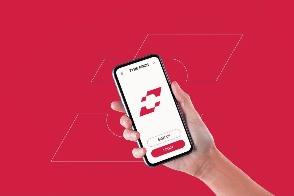
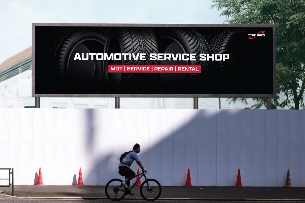
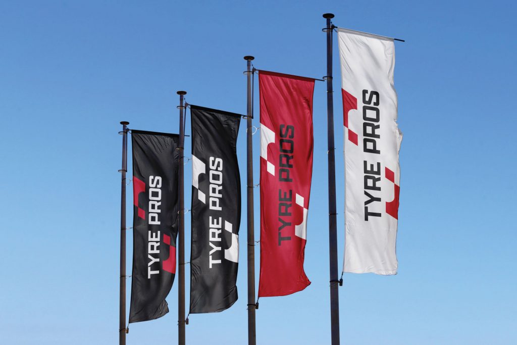
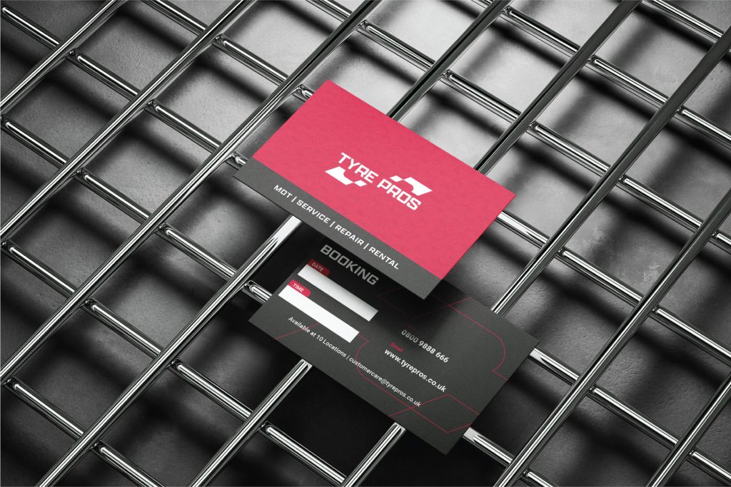
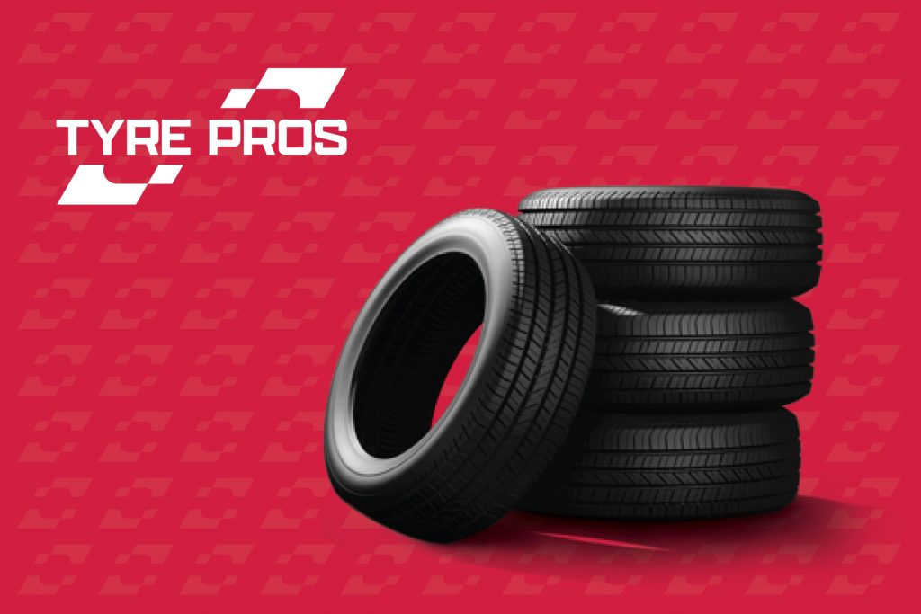
The result is a modern, scalable logo. It keeps the brand’s colours but is now clearer and more adaptable across print, digital and signage.
Project Name/ Client:
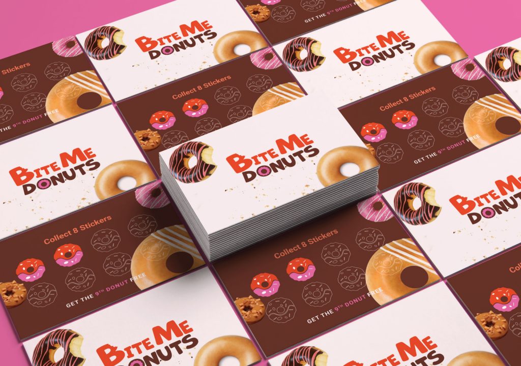
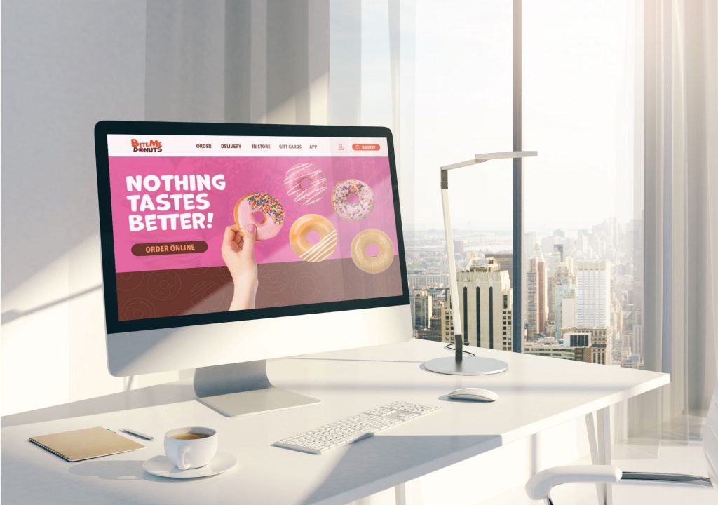
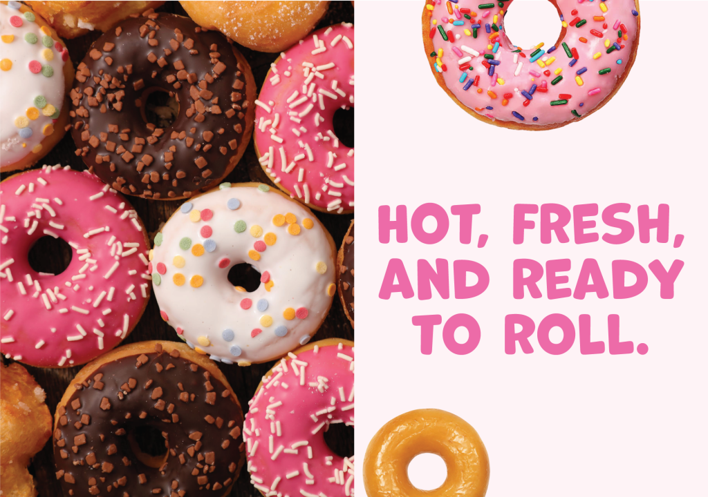
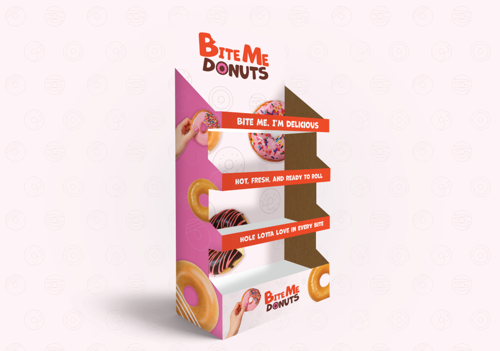
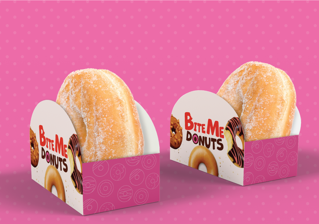
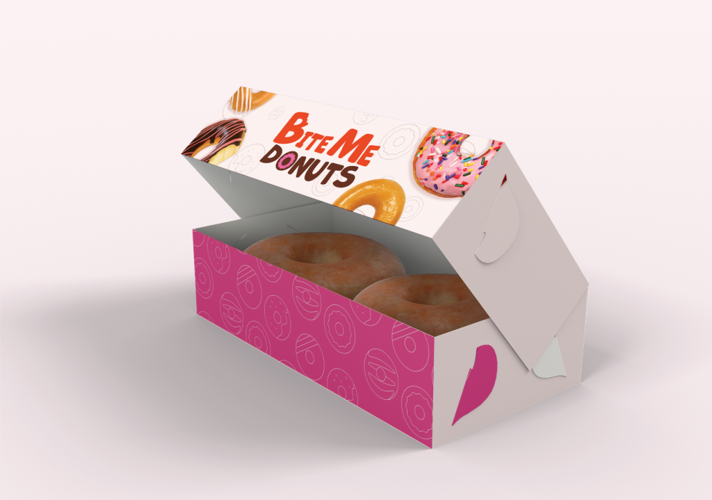
Bite Me Donuts
Role:
Brand Designer, I led the development of the visual identity for Bite Me Donuts. I was responsible for concept creation, design direction, and ensuring brand consistency across all touchpoints.
Brief:
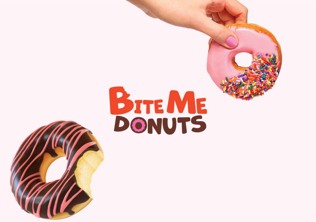
I was the Brand Designer tasked with creating a playful and inclusive identity for Bite Me Donuts. The goal was to build a fun, eye-catching brand that appeals to all ages.
Process:
The design process focused on bold colours, playful typography, and the use of donut icons to convey flavour and personality. Donut imagery and graphic elements were used throughout to create a cohesive visual language. Concepts were refined based on feedback to ensure the brand felt welcoming and fun.
Outcome:
The final identity is bright, bold and full of character. Donut icons and playful visuals bring the brand to life across packaging, social media and in-store displays, making Bite Me Donuts instantly recognisable and approachable.